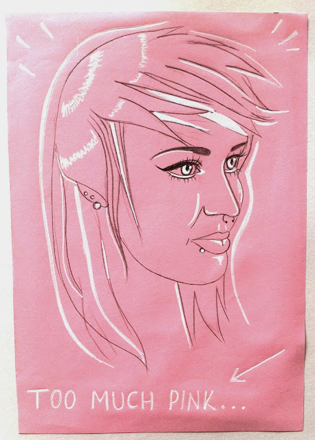
Here are some of my sketches that I will develop into my final poster design on Photoshop. I shall use a combination of coloured pencils and digital techniques to create the poster. I really loved using white ink/gel pens and POSCA pens on top of pastel coloured paper as they highlight the highest points on my drawing which unintentionally creates shadows. I do think that I should have initially used black fine liners for the main outline as pencil is not as bold and therefore isn't the right medium to be creating a graphic-style image.
I added these extra lines around my portraits to represents urban art in Manchester found around the Northern Quarter. These lines remind me of graffiti art I have seen within the NorthernQuarter.
I've scanned in my drawings and slightly edited them to make them brighter for when I use them in Photoshop. This time round I have made sure that each drawing has a bold outline so that I will find them easier to manipulate on Photoshop. The females have been drawn in red pencils and the males have been drawn in blue - this is because I think it will be a good contrast when lines overlap on my final poster. I have not gone into too much detail with these particular pieces because I wanted them to look hand drawn and slightly rough and textured to reflect the nature of people in the city of Manchester. The shading is a little harsh and not hyper-realistic but I like this because it looks like a drawing rather than a photograph.


By leaving my subject matter's hair blank and not emphasizing it by applying detail, I have thought ahead and have allowed myself to create blank spaces when overlapping my drawings for the final piece. If my drawings had no blank spaces, then they would look utterly chaotic and the viewer would not be able to differentiate them when they have been layered on top of each other in Photoshop. I have prepared them for layering.


No comments:
Post a Comment