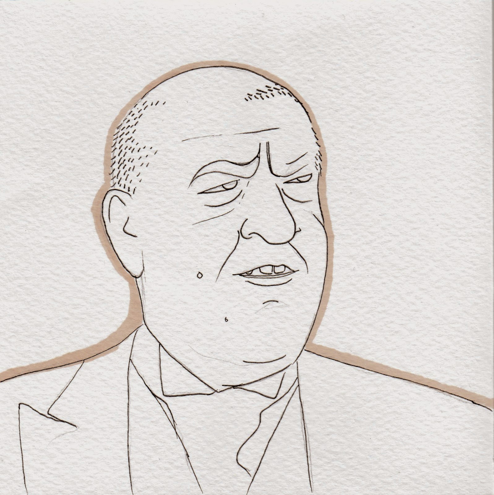
These sharpie and biro pen drawings were initially for the 6 x 6 brief - However since I have not decided what path to follow I've decided to experiment and play around with different ideas. I started to draw individuals who are from Manchester.
How are they linked and how do these illustrations suggest that these people originate from Manchester?
I am yet to conjure some ideas in which I could portray elements of Manchester within my work.
Some of my drawings have been tweaked in photoshop to make the image like vibrant prints.
I find it hard to create quick line drawings so for me, practicing this skill has been very beneficial as it allows me to be expressive and use different types of line and textures.
I love to scribble
I've taken my original line drawing and created edgy prints. I do like the monochrome poster print because its simplistic, however, as I usually stick to traditional mediums over digital technology - the warm tones of green and stone are appeasing to the eye. Also it is difficult to achieve a flat colour with pencils and markers which is why I have used photoshop to develop my ideas.
Developing Ideas....
Biro pen drawing on acetate.
Above you may have noticed that I have used inappropriate phrases within some of my illustrations. This is because I would like to explore transience between retail workers and their customers - how they treat each other - what do they say - is there awkwardness - any funny stories etc..
I've chosen these individuals to narrow down the types of people I am going to look at. I'd like to illustrate their transience with GENUINE words that they state and facial expressions during the moment the strangers meet.
I have personal experience working with the public and have started collecting information, words and other things that interest me whilst working at my part time job in a grocery store.
I want to portray the working people of Manchester; ordinary people.
Afterall, the symbol of Manchester is the worker bee which means the workers and everyday people of Manchester make the Manchester community and what it is today.


Experimenting with photography around Manchester I have psychically cut out duplicates of my original sketches and layered them on top of my photographs. I've left the sketches in monochrome and grey-scale as I like the contrast between the rich colours of places in Manchester and the 'washed-out' portraits of people in Manchester. Iv'e always been fond of chiaroscuro which is the Italian word light-dark tonality in art. It is the use of strong contrasts between the light and dark, usually bold contrasts affecting a whole composition. After ive played around with simplistic line drawing I would like to add tonality to my drawings as I progress in my current project.
Sophie Henson
Sophie Henson as a Illustrator and Designer has been an inspiration for my quotations and line portrait ideas. Since graduating in 2004, she spent 3 years working as a print designer before stepping out as a freelance illustrator. Henson also keeps up to date with her own blogs and social media accounts and it is interesting to see what work she recently has been creating. Her preferred tools of the trade revolve mainly around pens and pencils followed by Illustrators and Photoshop.
I quite like her typography as this is the definitely the type of contrasting fonts and language i'd like to use for my own personal project.
Nathaniel Russell
I discovered his work through a publicized listography I own called 'Love Listography'. He is one of the illustrators for these chronicle books and injects comical style when creating his drawings.
Below are my own watercolour and biro pen drawings that have been inspired by the illustrations of Nathaniel Russell.
Watercolour and biro pen on paper to learn the methods of Nathaniel Russell. Note to self: Use thicker paper so it doesn't bubble from the water droplets. Also use a better camera that can take high quality photographs.
Worker Bees and Symbols In Manchester
Research into the different types of bees and how the look.
The first bee to be drawn with white chalk on pastel paper. Using chalk was a bad idea as I wanted a cleaner image that could have been possibly used for my Postcard design. Nevertheless, the contrasting qualities between the chalk and the pastel paper were subdued but is now appealing and eye-catching.
Note that this ancient Parish Map of Manchester reproduced from the Victoria County History of Lancashire, which I've layered under my bee symbol, is dated back to 1800's and therefore since has extended its boundaries. Withington was nonexistent in the early 1300's before the barony of Manchester was formed and governed by Salford. It was later gifted to Manchester: Didsbury, Chorlton, Burnage, Levenshulme, Rusholme, Mosside and Denton.
This map was an interesting eye-opener of when Manchester was extended to the Manchester it is today. Oldham and Prestwich are now apart of Greater Manchester, however have not been included on the map I have used behind my bee drawing.
I selected this particular map as its border lines were prominent and each area was labelled clearly. In addition, the lines on the Parish map create a subtle texture
Overlapping of my line drawings on Photoshop.
Inspiration for future portraits - surrealism - contemporary


.jpg)


.jpg)


